Goals & Vision
Integrate custom card design with ordering in a them-able tool that can be plugged into our own and our partner websites. The solution had to work for everyone from consumers to professionals and provide trusted design and printing outcomes every time.
Desired Response
Adoption of this new software for design and ordering was the key metric which was expected to convert into more card sales. This meant the tool had to integrate into workflows and add more value than traditional design and ordering patterns.
Process
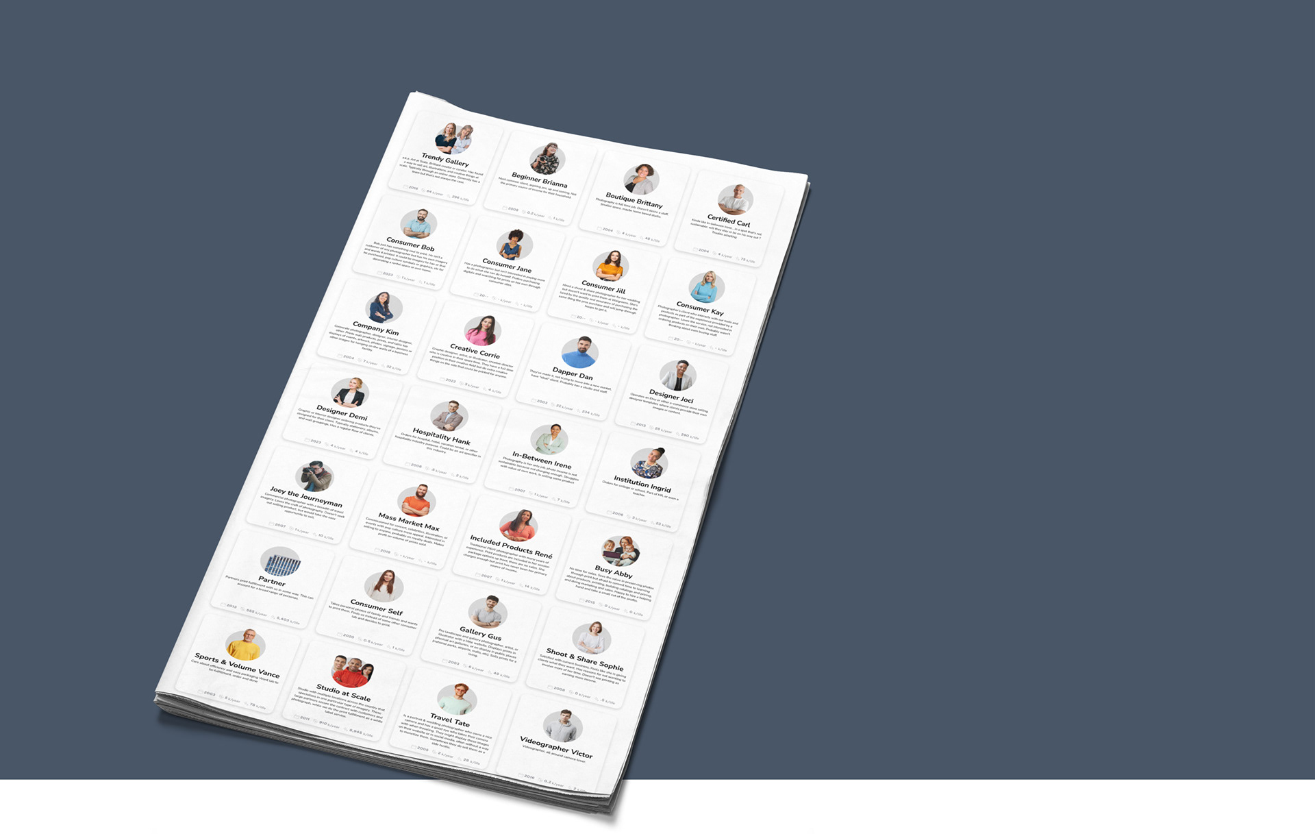
1. Research & Personas
I started with Persona research to understand and document design needs. I've continued this research over the years as more and more users were discovered through data observations, interaction with clients, and collaboration with business strategy and marketing teams.
2. Competitive Product Analysis
Other solutions existed in the consumer market but there was nothing in the professional photography market of this nature. I found that consumer tools at this time were very complex and required design skills. Because of this open-ended flexibility it took longer to design cards and results weren’t always pretty.
3. Ideation
A couple mockups had been explored before I was brought in to take the work to and across the finish line. Given the research and new stakeholder input, I began sketching for improved navigation and selection menus, crafting components, and interacting with engineering to design within constraints.
4. Prototyping
Early prototypes made with Pixate, Origami Studio, and Framer
5. Testing it out
InVision was used to run through a series of user tests with different interfaces. The goal was to evaluate clarity and understand which navigation and selection structure performed the best.
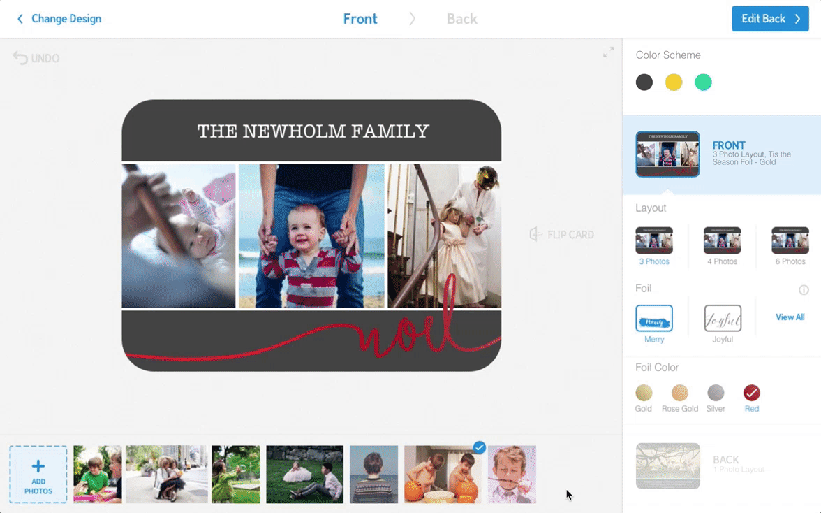
6. Evolution
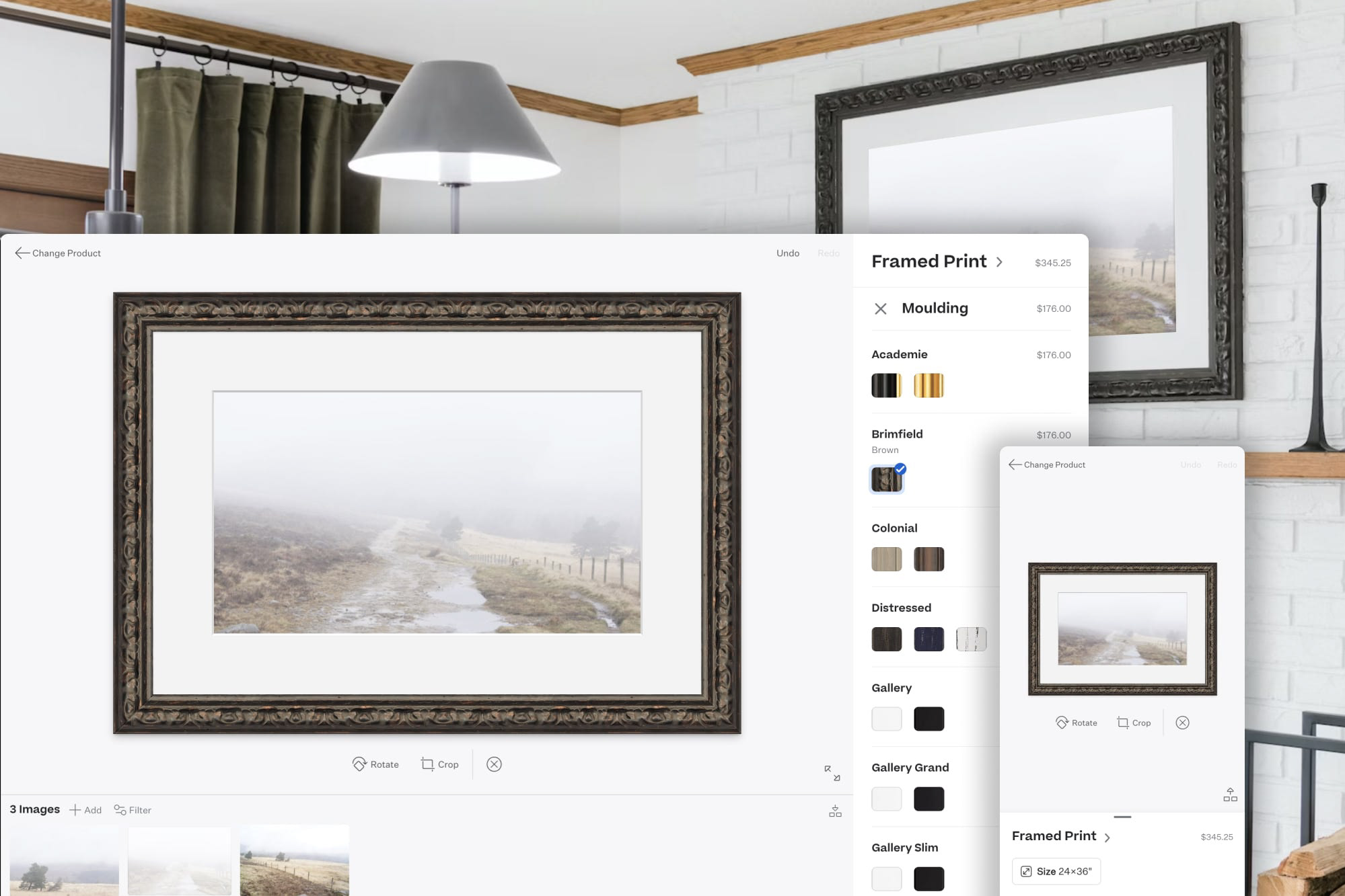
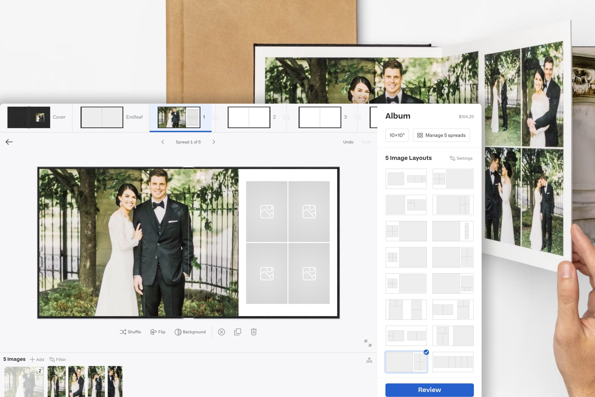
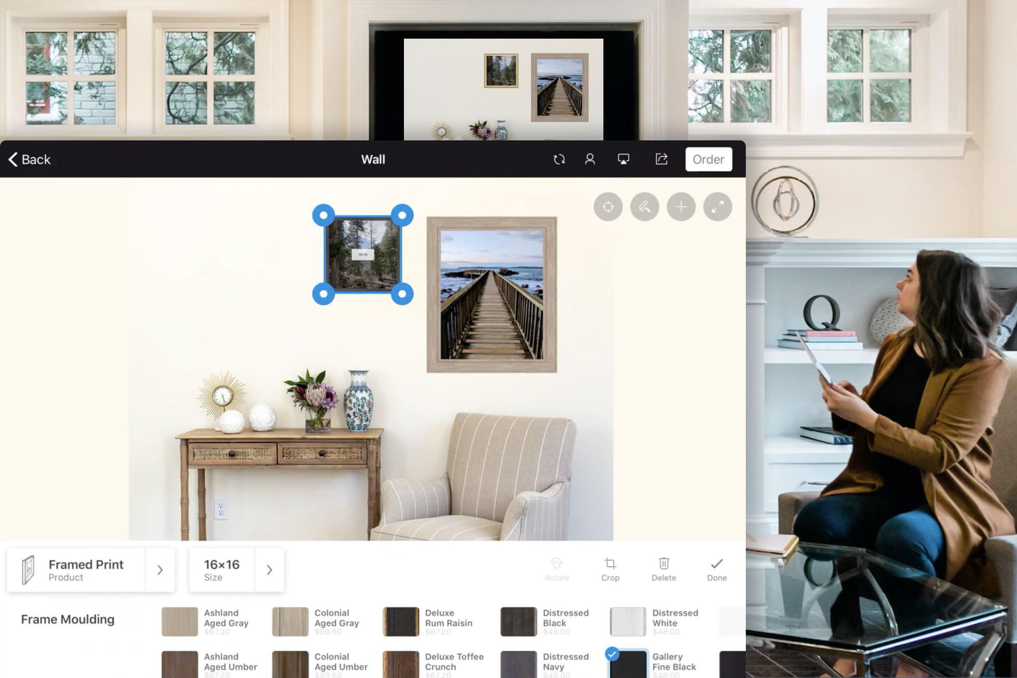
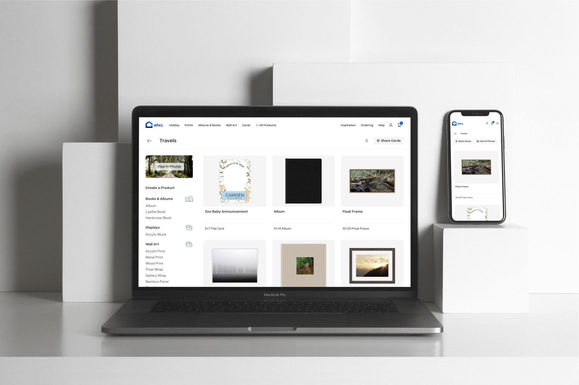
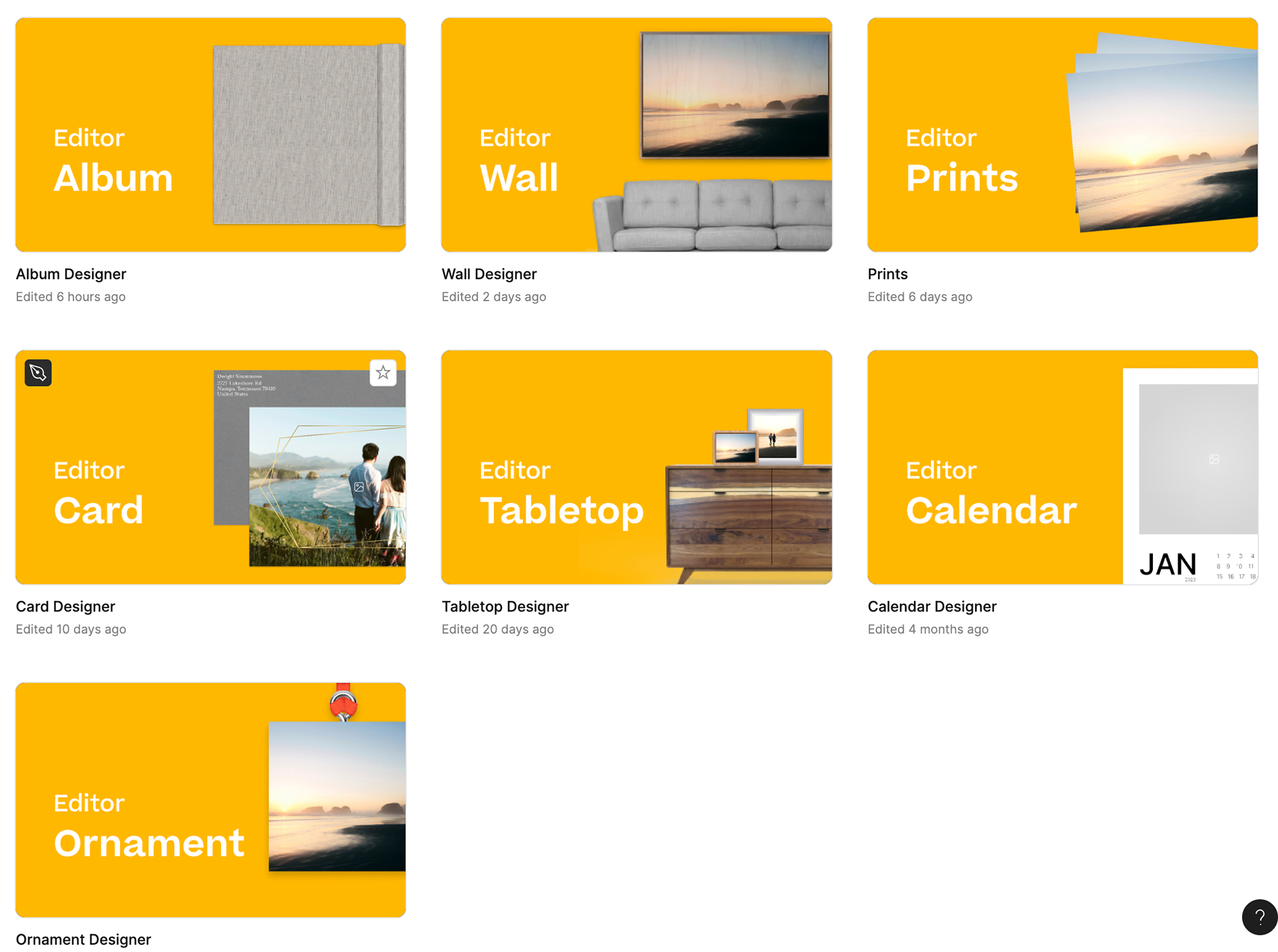
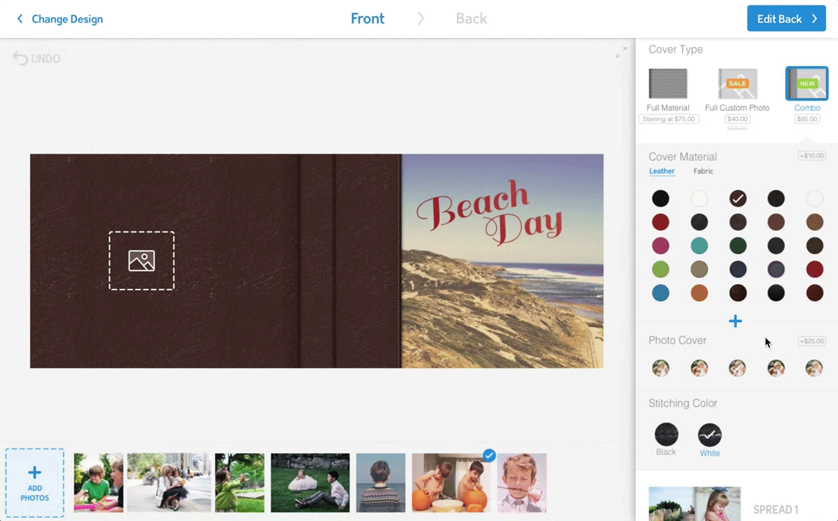
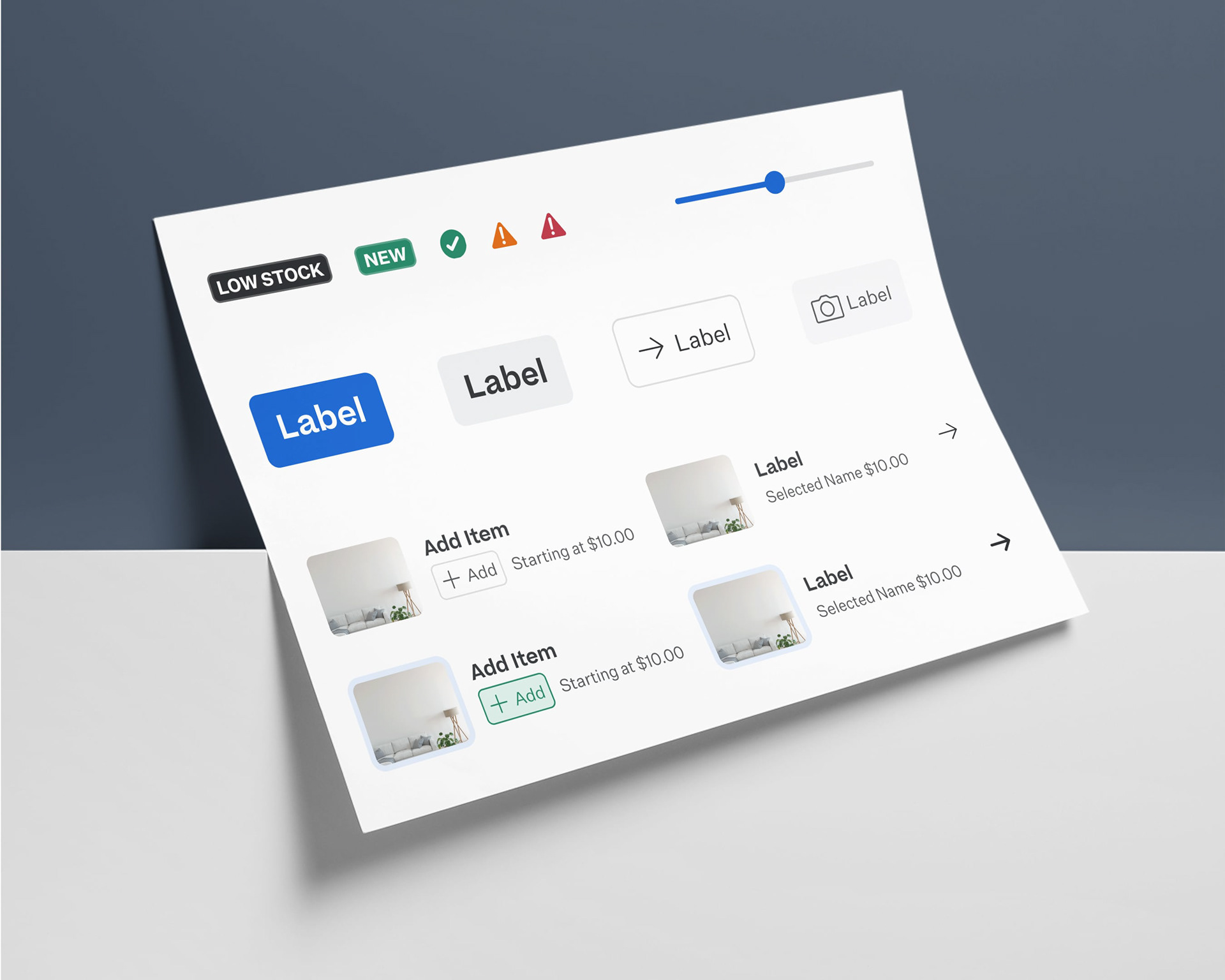
Countless rounds of mockups, prototypes, and user testing helped to formulate an editor baseline interface with versatility to start supporting a wide range of products beyond just cards.
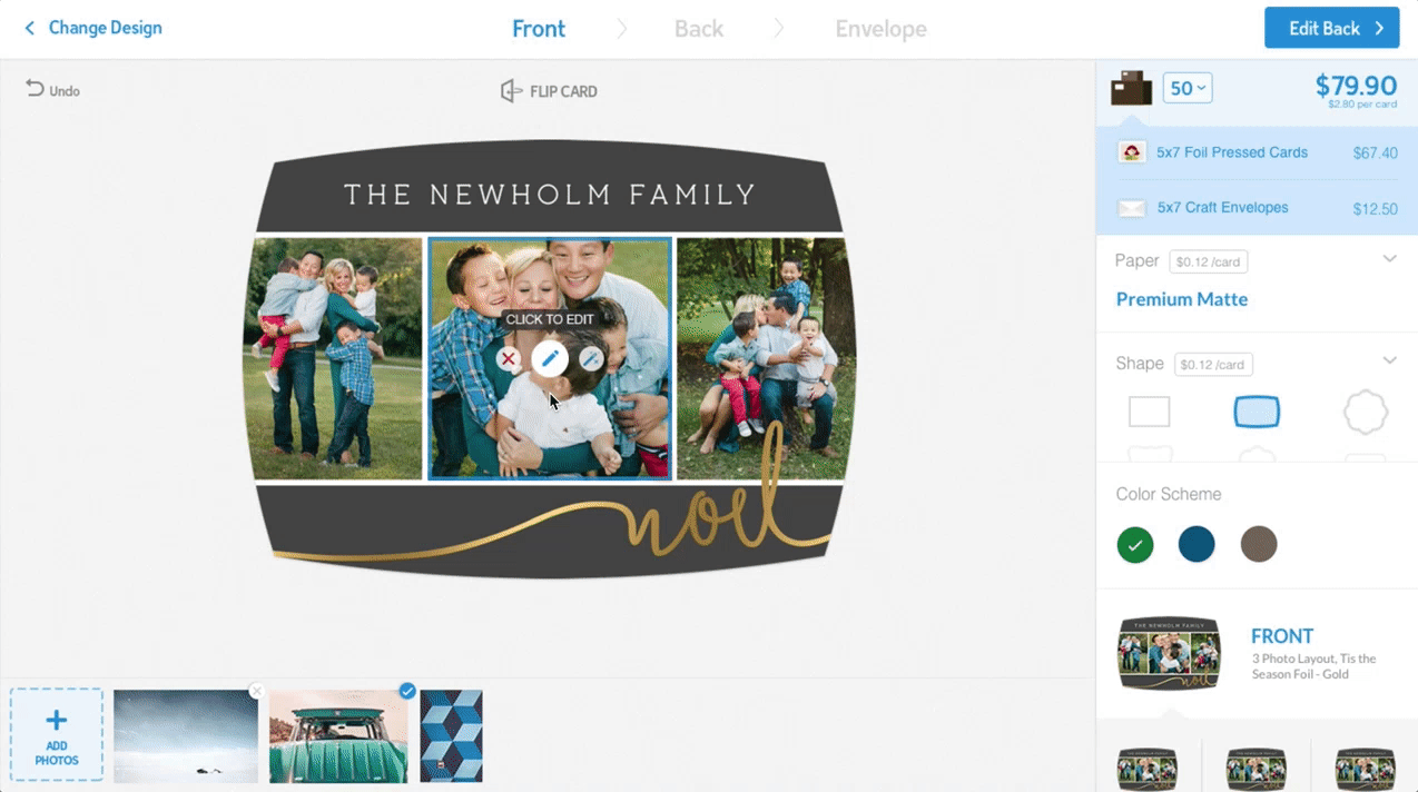
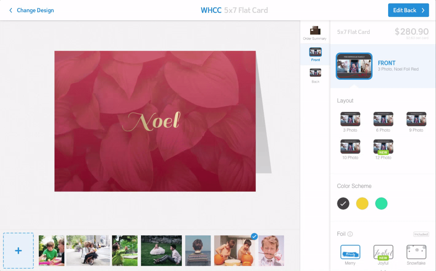
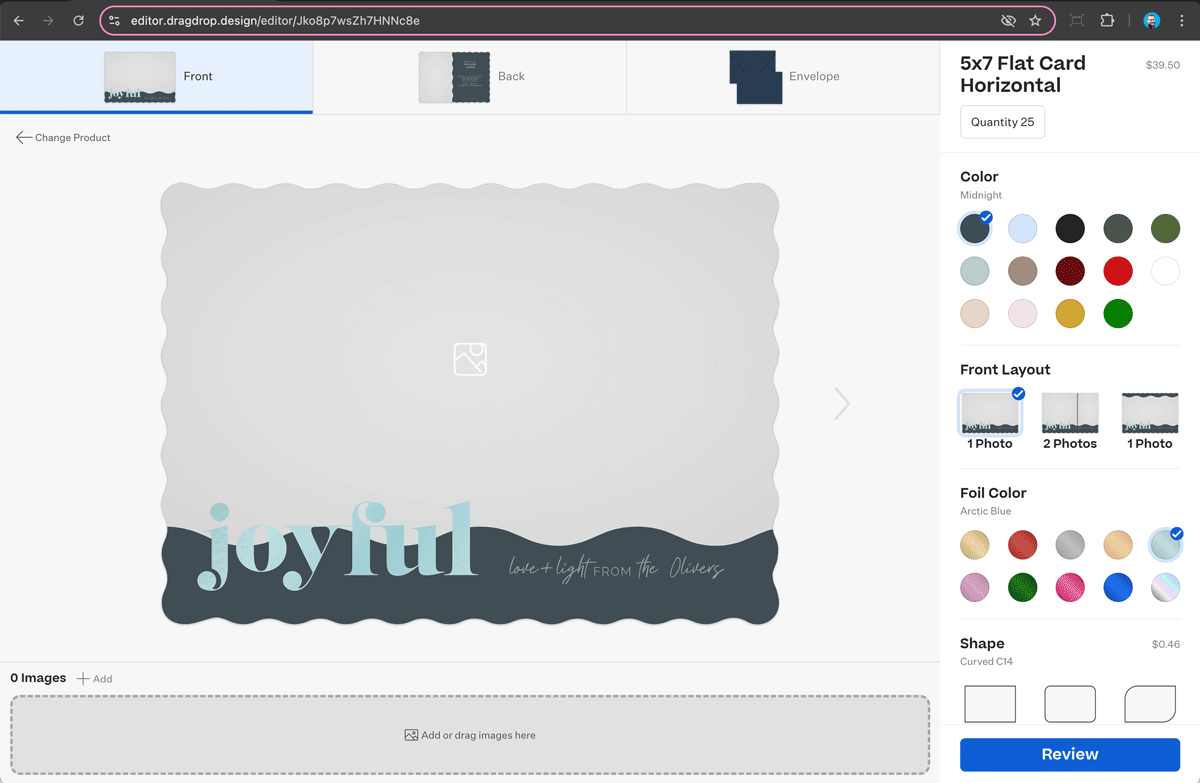
GIF showcasing the versatility of the interface across a variety of products
7. Problems & Solutions
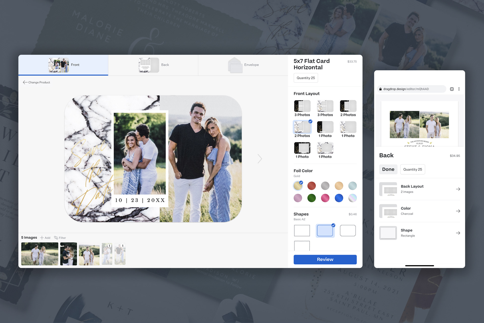
Selections were sometimes difficult to make without more information. Larger thumbnail selection components were created and ideation for exposing more information about selections was done.
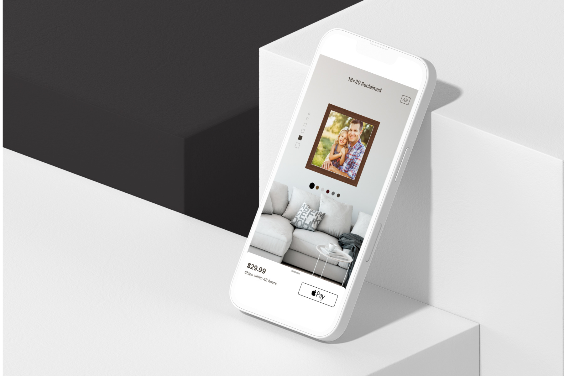
Demand for this tool on mobile devices grew over the years. The layout was designed for desktop with mobile in mind, but interactions in particular needed to be refined for the small touch screens. Mobile prototypes were created and tested with users to refine this workflow. Sorry I can't share them.
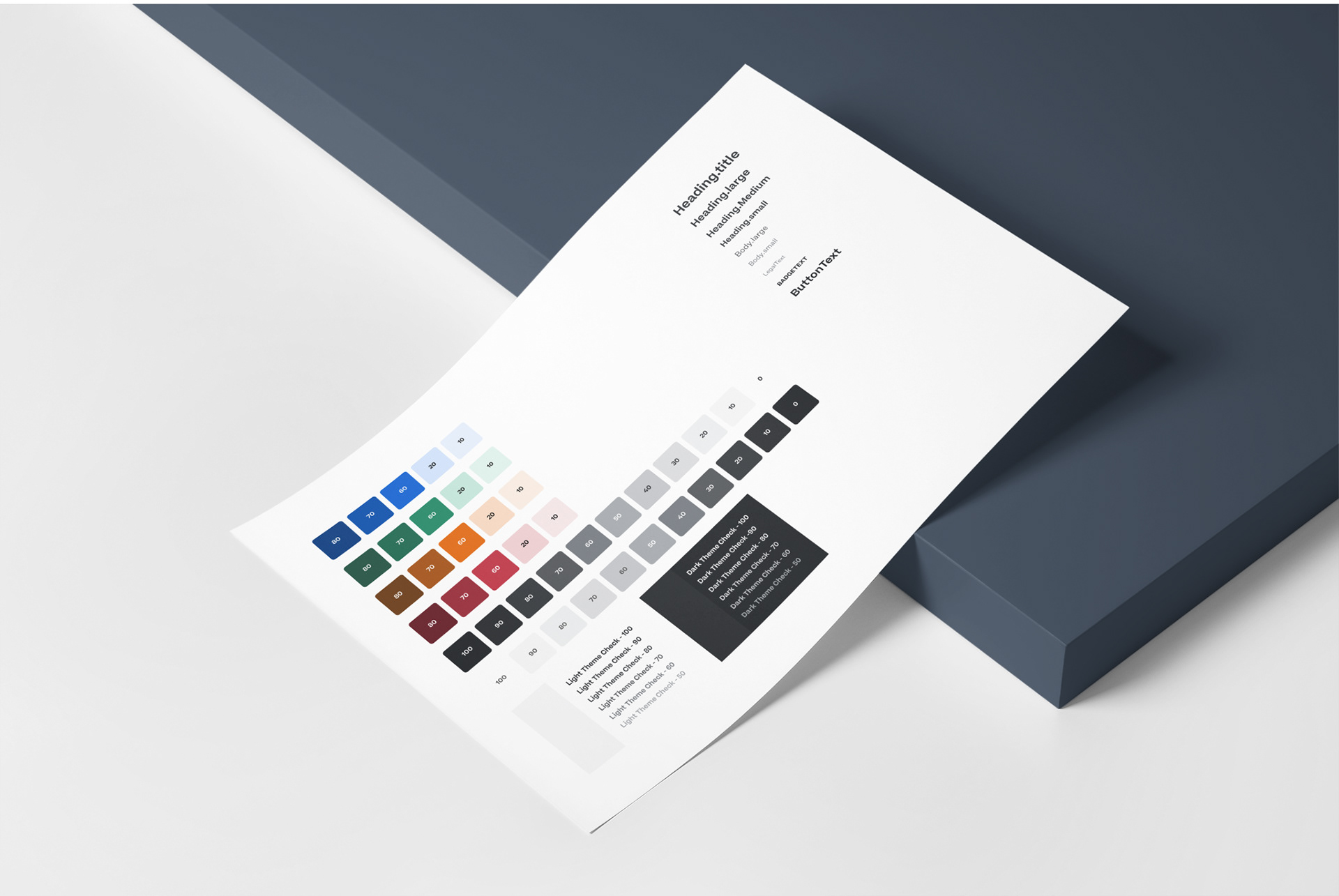
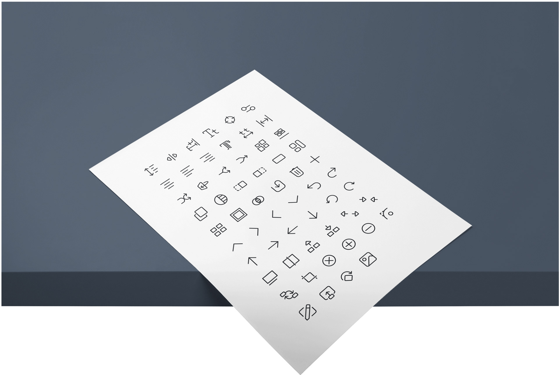
8. Building a System
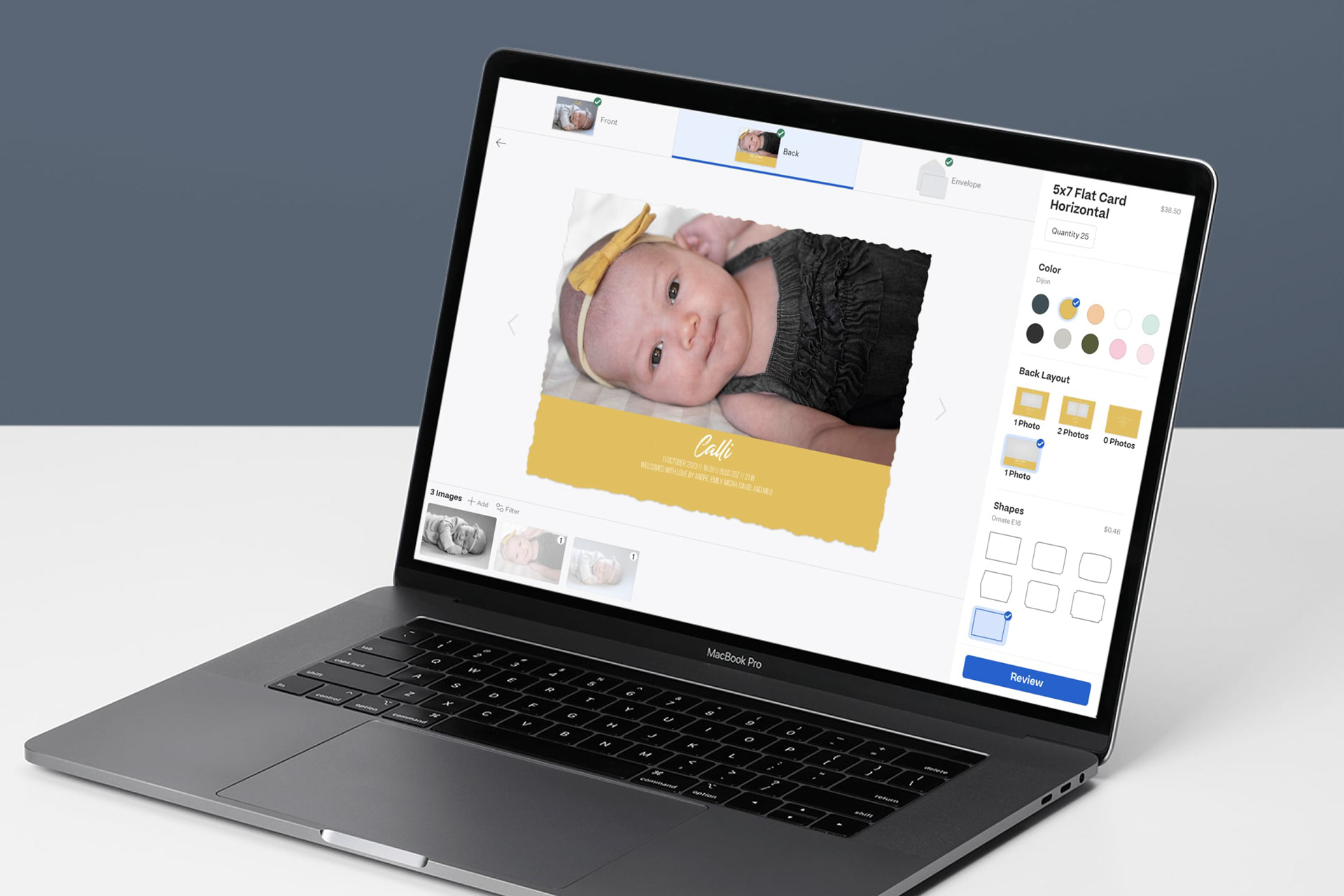
To be more efficient in design and engineering and to maintain consistency across our expanding tools; I created a theme structure, design system, and component library using Figma, React, and Styled Components which has continued to be developed and iterated on throughout the years. All of this documented with product language guidelines in Storybook and Zeroheight.
Results
Adoption of the Card Designer has grown year over year. The success of this tool set off the plan for creating more apps just like this one.
Here are a few things customers said in response to this new tool:
"I am going to do cards for everything now! Thanks for making this SOOOOO easy!"
"I love the ease of this ordering system!! No more wasted time in Photoshop!! Thank you for making my life easier!"
"I will start offering cards again!!"
"It was quick, easy and fun to use."
"I love that your lab offers this. I love playing in photoshop, but this saves me so much time!!"
"It was so much more difficult before & really not worth the effort"
"Life changer!"
"I love the ease of ordering. This was our studio's first time ordering and I was afraid it was going to take me time to learn the online system. It only took me 15 minutes and that was because I had to double check the spelling on the names!"
The Real thing Now